
A Fresh Look at Analytics

I gave the analytics page in trydeepwork a fresh look.
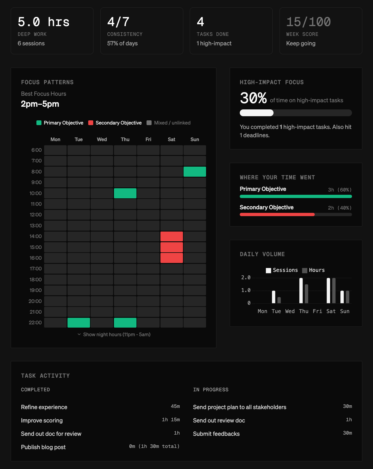
The underlying data and ideas are the same, but the layout is cleaner and more opinionated about what matters: when focus actually happens, how time is split across objectives, and what concrete work got done in a given week.
The goal with this revamp was to make the page scannable in under a minute. You should be able to open it, get a quick read on your week, notice one or two patterns, and move on. Less interpretation, less digging.
It’s still a reflection of what already happened, just with fewer distractions and clearer grouping.
If you’ve been using the analytics view before, I’d love feedback. What’s clearer now? What feels missing? Anything you’d change before this settles?